
Context
The Michigan Medicine Clinical Homepage is the clinical website for one of the top healthcare complexes in Michigan. It is the primary portal used by medical professionals (including doctors, nurses, pharmacists, residents, physician assistants, and specialists) to access essential information for patient care. Links include medication & treatment guidelines, pain management protocols, patient information, and more.
The site is a crucial part of daily hospital workflows, yet its outdated design and poor information architecture made navigating the portal time-consuming and error-prone.
Problem
The Chief of Staff recognized that medical staff were spending unnecessary time locating information due to the site's confusing layout, inconsistent naming conventions, and overcrowded content.
These inefficiencies directly impacted patient care, as more time spent navigating the portal meant less time attending to patients. The goal was to redesign the homepage to improve readability, reduce cognitive load, and streamline access to essential clinical resources.
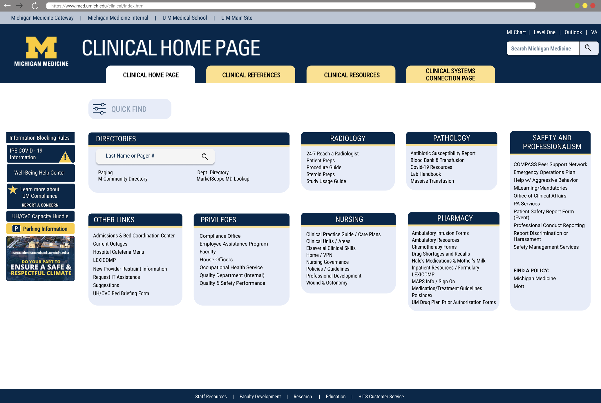
See the original Clinical Homepage design below.

My Role
Chloe Minieri
Lead Researcher, Assistant Designer
I led UX research for the Michigan Medicine Clinical Homepage, framing research, conducting user interviews and surveys, analyzing findings, and ensuring the design improvements directly addressed clinical staff needs to improve patient care.
Project Team
Research Overview
The Clinical Homepage served a diverse group of medical professionals, each operating under strict time constraints and varying levels of familiarity with the system. While long-term users had adapted to the existing layout, early conversations revealed that efficiency often depended on memorization rather than intuitive design.
To ensure design decisions addressed real workflow needs rather than legacy behaviors, research methods were intentionally selected to capture both quantitative patterns and qualitative insights across roles and experience levels. This approach helped surface usability issues that directly impacted efficiency and patient care.


Key Findings
Research revealed that experienced staff navigated the Clinical Homepage through memorization rather than intuitive structure. Content density, ineffective search, and concerns about workflow disruption further limited efficiency and accessibility.
Finding 01
Navigation relied on memorization rather than clarity
Although 90% of survey respondents described the homepage as easy to navigate, all were long-term users (5+ years). Interviews revealed that navigation success depended on familiarity with link placement, creating friction for newer staff.
→ Design implication: Establish a clear information hierarchy that supports first-time and infrequent users.
Finding 02
Dense and inconsistent content increased cognitive load
Users struggled to locate critical resources due to overcrowded sections, inconsistent tab layouts, and more than 15 broken or duplicate links, slowing task completion.
→ Design implication: Reduce content density, remove redundancies, and standardize layouts.
Finding 03
Search functionality did not support clinical workflows
The search feature returned general institutional content, forcing medical staff to manually sift through results to find relevant clinical information.
→ Design implication: Prioritize clinical content and introduce filtering to surface relevant results.
Finding 04
Users were cautious about disrupting familiar workflows
While users acknowledged usability issues, many expressed concern that significant layout changes could disrupt established routines.
→ Design implication: Introduce improvements incrementally while preserving familiar patterns.
Finding 05
Daily use feels overwhelming due to high link density
Clinicians often described their daily navigation as frustrating: “Finding a link in the homepage is like finding a needle in a haystack.” High link density and inconsistent labeling slowed down routine tasks, reducing time available for patient care.
→ Design implication: Simplify link presentation, group related content, and highlight high-priority resources for faster access.
Design Process & Iterations
I loved seeing the potential impact of this redesign. Many clinical staff had memorized the existing homepage layout and navigated it with ease. This familiarity was critical: the Clinical Homepage is a tool for real-time patient care, so our focus was on efficiency, clarity, and minimizing errors, rather than aesthetics.
Our design process balanced improving usability for new staff with maintaining consistency for long-term users. Every iteration prioritized workflow efficiency and reduced cognitive load while preserving familiarity.
Establishing Information Architecture
Created clear wireframes and IA for key clinical workflows:
- Accessing frequently used clinical links
- Searching for patient-related resources
- Managing department-specific tools
- Onboarding new staff with clarity and minimal confusion
Competitive analysis informed content prioritization, creating an intuitive, staff-centered layout that reduced unnecessary scanning or memorization.
Iteration & Refinement
Multiple rounds of usability testing helped refine the homepage according to actual staff workflows. Key improvements included:
- Simplified navigation for high-frequency clinical links
- Enhanced labeling for search and quick-access functions
- Optimized layout to reduce time spent locating resources
Designs were tested for clarity, efficiency, and consistency, ensuring that even new or rotating staff could locate critical information quickly without relying solely on memorization.
Aligning with Clinical Workflows
Designs focused on supporting real clinical tasks rather than visual flair. Early wireframes that grouped content by severity created unnecessary decision points, especially in time-sensitive scenarios.
Later iterations prioritized high-frequency actions such as accessing guidelines, while secondary resources were moved to clearly labeled supporting sections. This reduced visual noise and improved orientation for both new and experienced staff.
Summary of Design Approach
- Balanced usability improvements with consistency for long-term users.
- Prioritized efficiency and clarity over aesthetics.
- Refined through iterative testing and feedback to support real clinical workflows.
- Ensured navigation and content hierarchy minimized cognitive load and decision fatigue.
Example Design Decisions, Before/After Improvements
Insights from research directly informed key design changes. Each improvement addressed specific pain points while enhancing usability and efficiency for staff.
Simplifying Navigation Menus
Problem: Users hovered over menu items to see pop-ups with links, which they found unnecessary and tedious. We originally thought this would reduce visual overload, however they preferred seeing all relevant links immediately.
Solution: Remove hover-based pop-ups and display all links directly in the menu for immediate access.
Before
Clarifying the Search Feature
Problem: When the “Search” feature was represented by an icon, users were unsure whether it searched the website or performed a general Google search.
Solution: Renamed the feature to Quick Find and changed the icon to a filter symbol. This communicates that users can filter and locate links within the Clinical Homepage directly.

Before
After

After
Final Prototype — Clinical Homepage
I am proud of how our team redesigned the homepage to make it faster and easier for medical professionals to find critical information, giving them more time to focus on patient care. By prioritizing UX and workflow efficiency, we supported better health outcomes, improved provider satisfaction, and increased operational efficiency.
Prototype Highlights
- Intuitive navigation: overcrowded sections reduced; links prioritized for clinical workflows.
- Consistent layout: uniform design across all tabs to reduce cognitive load and speed access.
- Quick Find search: filtered search returns only relevant clinical content.
- Error prevention: broken or outdated links removed; naming conventions standardized.
- Workflow-focused: designed to let staff spend more time with patients, improving care and efficiency.
User Impact & Feedback
- Pharmacist, Michigan Medicine
- Pediatrician, Michigan Medicine
- Nurse, Michigan Medicine
Enhancing the Clinical Homepage after 20+ years, our team applied research-driven design to improve daily workflows. This recognition and feedback reflect the tangible impact on patient care and provider satisfaction.

My Learnings
Reflections from leading research and design for the Clinical Homepage—insights that shaped my approach to high-stakes design.
Leading Research
I loved seeing how our design could make clinicians’ days smoother and give them more time with patients. Leading research taught me the importance of evidence-driven design decisions, and that observing real behaviors uncovers insights surveys alone cannot.
Collaboration
I loved how teamwork amplified our impact—every decision felt stronger when informed by diverse expertise. Coordinating with engineers, PMs, and clinicians reinforced that clear communication and trust are crucial to move quickly without compromising design quality.
High-Stakes Design
I loved understanding the weight of every click and interaction—these designs directly affected patient care. Clinicians rely on muscle memory, so I learned every change must enhance usability without disrupting workflow.
Reflection
I loved seeing our work make a tangible difference for staff and patients. Leading this project taught me to balance user needs, technical constraints, and clinical priorities, shaping how I approach every design challenge moving forward.