Context & Challenge
Scheduling at Carelon was slow, confusing, and manual. Members struggled to book appointments, and providers were overloaded with admin work, leading to delays, inconsistent experiences, and high call-center volume.
Before
Members submitted availability and waited for responses via email, often unsure of next steps. Providers managed requests manually through inboxes and spreadsheets, creating delays and administrative overload.
Business Request
Carelon needed a simple, scalable system that made scheduling fast for members and easy for providers while improving digital tool adoption across their nationwide network.
Solution
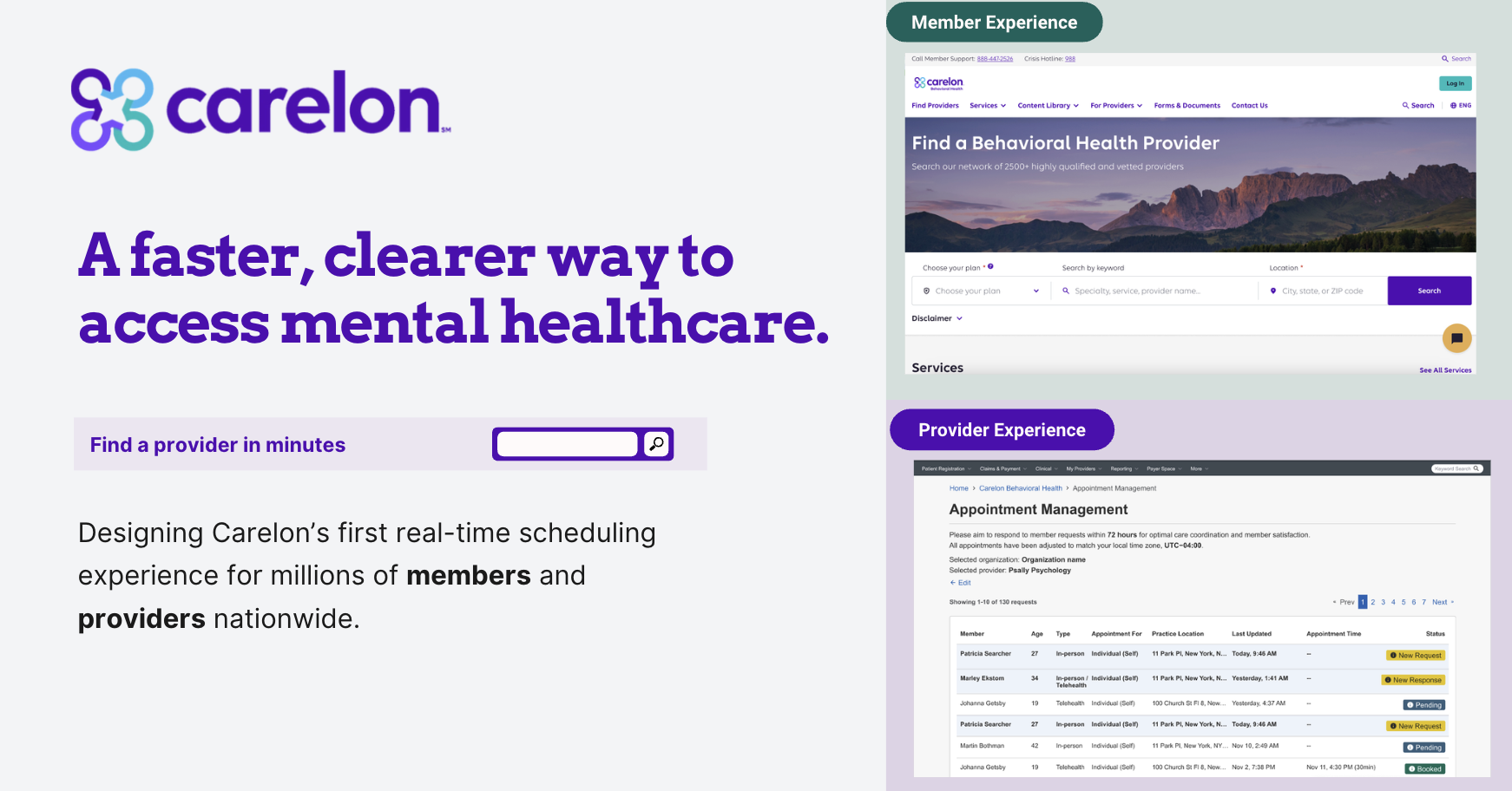
We launched Carelon’s first real-time scheduling experience inside both the member and provider portals. Members can book instantly, providers manage all requests from a unified dashboard, and call-center volume decreases, creating a faster, more consistent end-to-end experience.
Approach & Process Overview
The project followed a structured, end-to-end UX process, guiding every decision from research to delivery.
My Role
Led UX research and design for both member and provider experiences. Defined research methods, synthesized insights, and translated findings into actionable solutions. Balanced user needs, operational requirements, and technical constraints (e.g., integrating provider calendars) while guiding the team from high-level concepts to a polished, live solution.
Collaboration Model
Partnered with clinical, operational, and engineering teams to design solutions grounded in real-world workflows. Engaged stakeholders at every stage to validate assumptions and ensure feasibility. Maintained transparency with product and business teams to prioritize work effectively.
Research Approach
We conducted a two-phase research program to deeply understand the needs, behaviors, and constraints of members and providers. This ensured every design decision was evidence-based and practical for real-world behavioral health workflows.
Phase 1: Foundational Research
Goal: Understand user motivations, pain points, and workflow realities before exploring solutions.
- 👤 Member Interviews: Emotional barriers, expectations, mental models.
- 🏥 Provider Interviews: Capture workflows across solo → enterprise practices.
- 🗂️ Workflow Sessions: Map clinical & operations processes for feasibility.
- 📞 Call-Center Shadowing: Observe real-time friction in member interactions.
- 🔍 Competitive Analysis: Identify patterns & opportunities from healthcare and related industries.
Phase 2: Iterative Testing
Goal: Validate concepts and ensure experiences work in practice, not just on paper.
- 🖥️ Usability Testing: Observe interactions, comprehension, and emotional friction.
- 👀 User Observation: Identify hidden assumptions and real-time decision-making.
- ✏️ Iterative Flow Refinement: Adjust interactions based on feedback.
- 🤝 Stakeholder Alignment: Ensure clinical, compliance, and operational feasibility.
This approach built a solid foundation for design. Phase 1 uncovered real-world behaviors, while Phase 2 validated that solutions worked for both members and providers.
Phase 1: Key Research Insights
The following insights were uncovered during foundational research, highlighting key problems and their potential impact on the member and provider experiences.
Members Over-Rely on Call Center
- Problem: Members frequently call due to unclear system options, causing anxiety and longer wait times.
- Opportunity: Introducing a self-service portal reduces friction, empowers members, and decreases operational load.
Communication Friction
- Problem: Providers rely on emails and back-and-forth to confirm appointments, causing delays and errors.
- Opportunity: A dedicated provider portal streamlines requests, reduces errors, and improves scheduling efficiency.
Appointment Type Confusion
- Problem: Members often select the wrong appointment type, causing rescheduling and frustration.
- Opportunity: Guided workflows and clear categorization reduce errors and improve member confidence.
Operational Load & Drop-offs
- Problem: Manual handling of scheduling inconsistencies caused operational strain and appointment drop-offs.
- Opportunity: Automating the end-to-end process reduces errors and operational burden.
Clarity, Trust, & Tone
- Problem: Users feel uncertain about their actions, reducing confidence and adoption.
- Opportunity: Clear messaging, friendly tone, and transparency improve user trust and engagement.
Member & Provider Experiences
Our research revealed that the scheduling experience wasn’t simply inefficient, it was emotionally draining for members seeking help and operationally overwhelming for providers trying to deliver care. These journey maps illustrate the actual paths members and providers took before this project:
Design Goals
Based on our Phase 1 research insights, we defined core design goals that would guide concepting and interaction decisions. Each goal aligns with key user needs and informed specific design and functionality choices.
| Goal | Priority | Design & Functionality Choices |
|---|---|---|
| Member Empowerment | High | Members can choose directly from provider calendars, view provider photos, and select appointment types with clear descriptions. |
| Provider Efficiency | High | Centralized request portal, automated confirmation emails, and integration with provider calendars to reduce back-and-forth communication. |
| Clarity & Guidance | Medium | Step-by-step flows, clear labeling of appointment types, tooltips, and guidance messages for members and providers. |
| Operational Resilience | Medium | Error handling, validation for scheduling conflicts, and real-time updates to reduce manual intervention. |
Concepting & Ideation
With Phase 1 research insights and design goals in place, we moved into ideation, translating problems and priorities into tangible concepts. Our goal was to explore multiple approaches while keeping user needs, operational constraints, and clinical workflows at the center of every decision.
Sketching & Wireframes
Explored different flows for member and provider interactions, including scheduling, request handling, and communication, using low-fidelity wireframes to iterate quickly.
Cross-Functional Brainstorming
Collaborated with product, engineering, and clinical teams to ensure ideas were feasible, compliant, and addressed operational realities.
Concept Prioritization
Evaluated ideas against research findings and design goals, focusing on impact, usability, and scalability.
Rapid Prototyping
Developed clickable prototypes to visualize interactions and user journeys for members and providers, preparing for Phase 2 usability testing.
This process resulted in a set of mid-fidelity prototypes reflecting multiple solutions for key pain points and laid the foundation for Phase 2 usability testing, where we validated the concepts and refined the designs.
Defining the Flow, Ensuring Shared Understanding
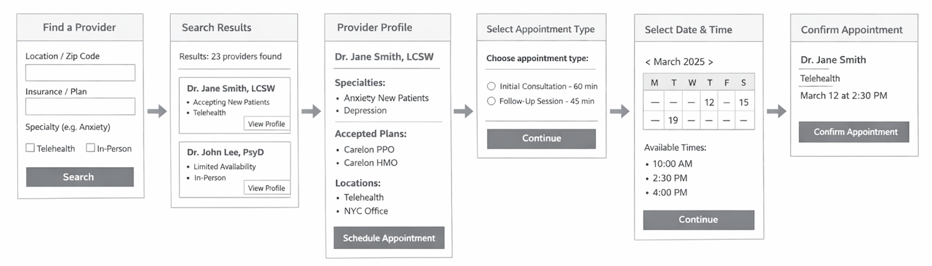
To establish a shared understanding of the existing scheduling experience, we first outlined the high-level end-to-end flow for Carelon Behavioral Health members. This artifact focuses on the primary steps and decision points in the scheduling journey, rather than detailed UI, so the team could align on overall structure, system boundaries, and moments of friction.
Bringing the Flow to Life
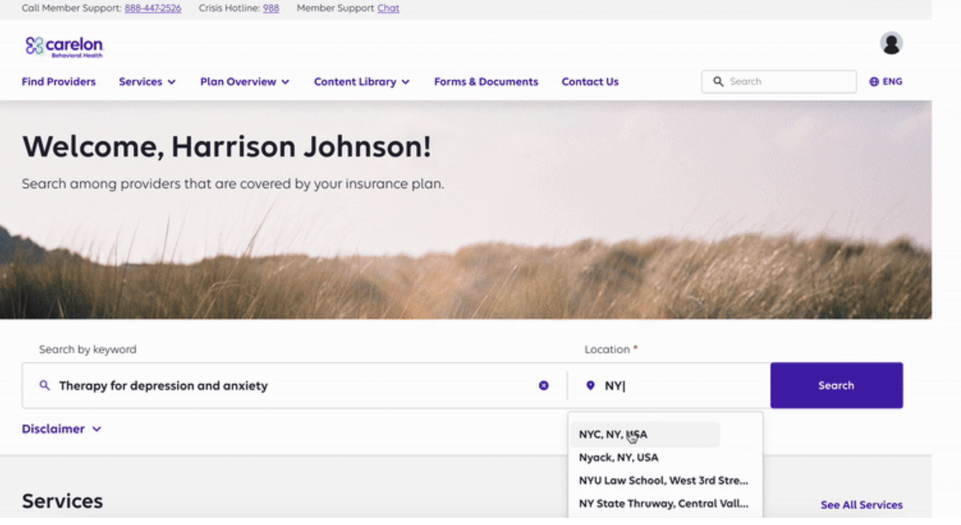
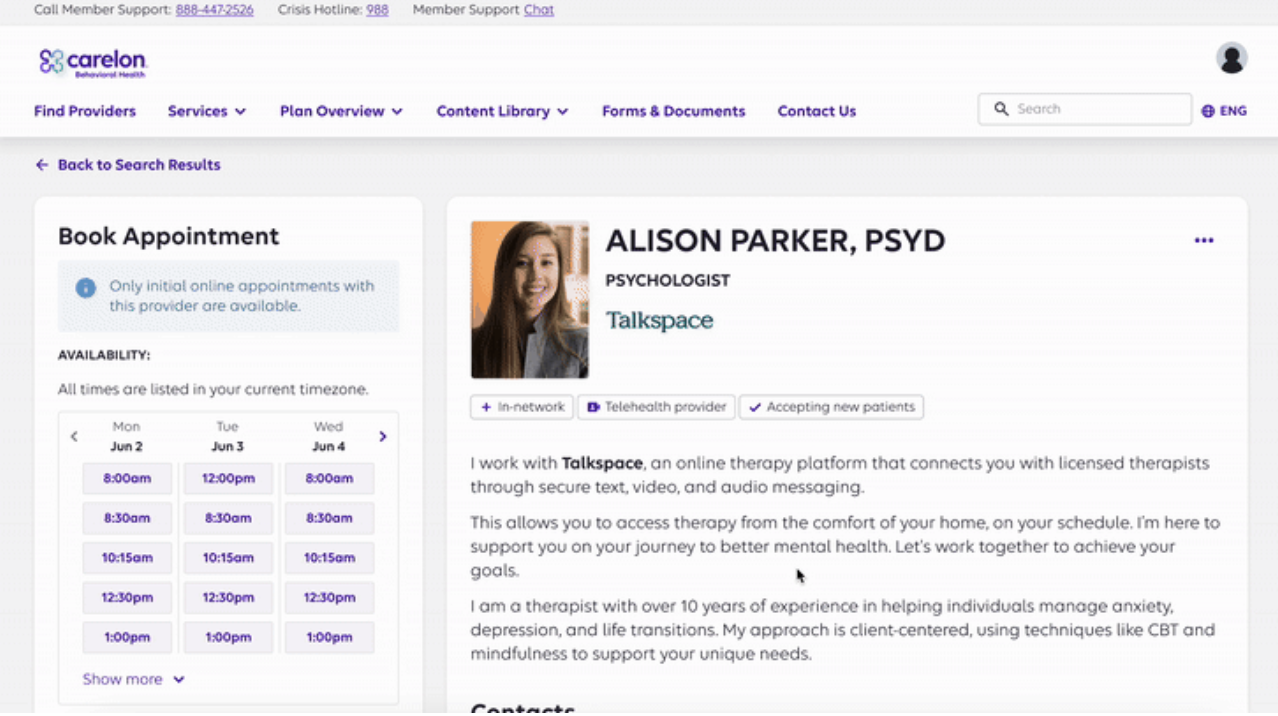
Once the high-level flow was outlined, we created key screens to represent the most important steps in the scheduling journey. These screens allowed us to visualize the experience, explore interactions, and prepare for usability testing. They capture the core decisions members face and provide a foundation for design iteration.
Phase 2 Usability Testing Findings
In Phase 2, we tested the updated scheduling flow with members and providers across multiple demographics. The goal was to uncover remaining points of friction and validate that our new real-time scheduling experience felt intuitive, empowering, and easy to complete. Below are example insights alongside the design changes applied.
1. Calendar Navigation
“I didn’t realize I could scroll to more dates. I thought there were only three days available.”
Applied Change
Added clearer left/right arrow indicators, subtle gradient for scrollable content, and increased contrast on future-date navigation controls.
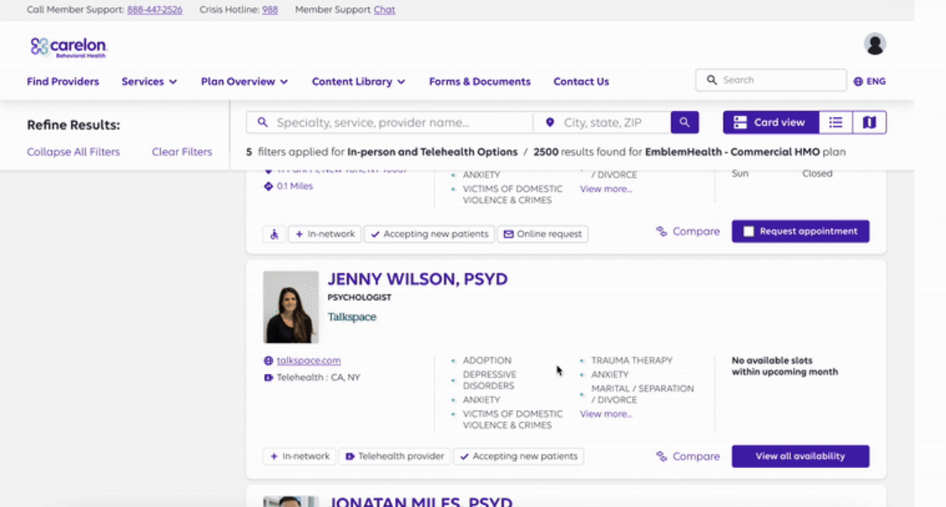
2. Provider Card Details
“I wish there was more information on each provider card so I do not have to click each one.”
Applied Change
Added key information for each provider on the search result card, acting as a summary highlight of the provider.
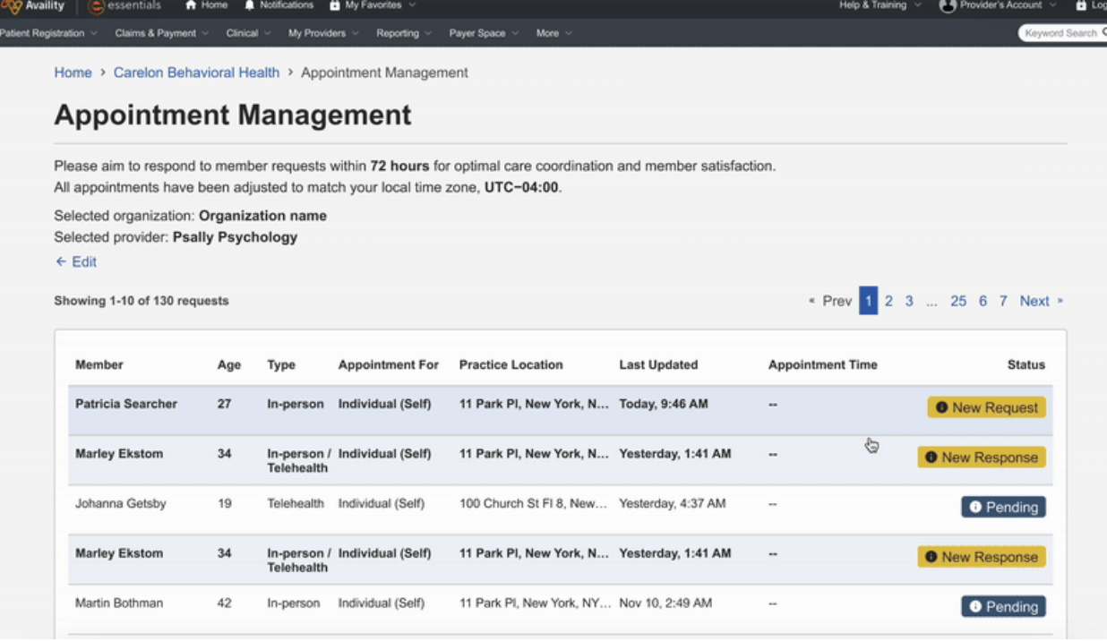
3. Provider Confirmation Screen
“After I clicked confirm, I wasn’t sure if I actually booked the appointment with the member.”
Applied Change
Added summary text under 'Booked' green tag stating "Appointment request with the member is confirmed.
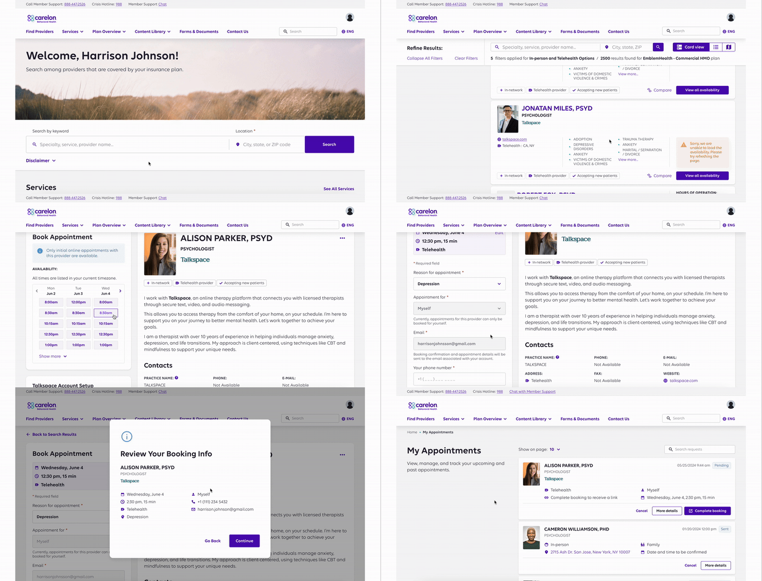
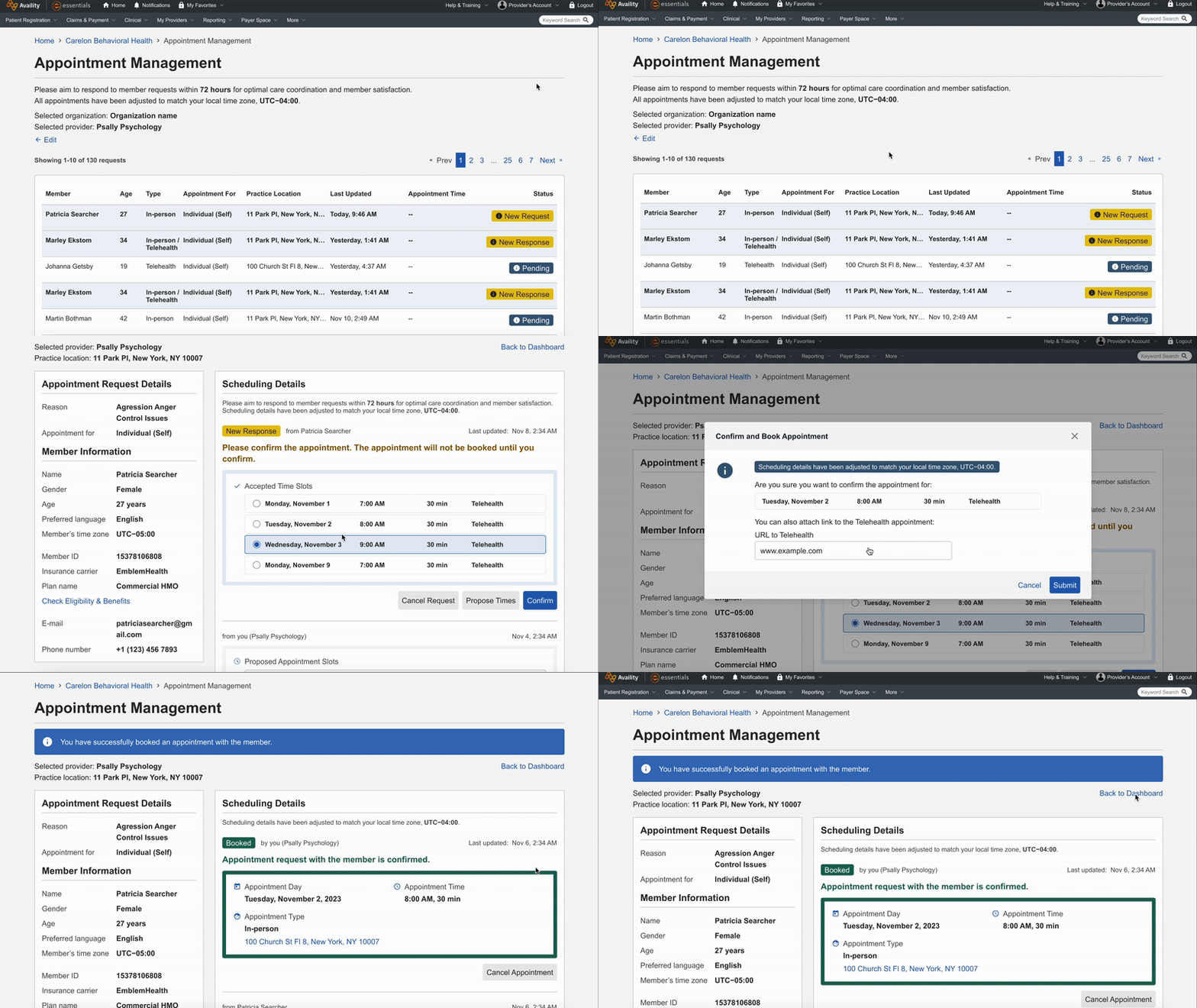
Final Product, Member & Provider Portals
Polished, production-ready experiences for both members and providers that replace clumsy email workflows and long call-center waits with a single, unified scheduling system.
Member Portal
Provider Portal
What I Learned
This project was a deep exercise in designing for people at difficult moments. Below are the takeaways I carried forward.
I’m grateful for the opportunity to design something that materially improves access to care. The project sharpened my craft, from research rigor to pragmatic design, and reinforced why thoughtful UX matters in healthcare.